— LAST UPDATED ON. april 2020
MIXED USE SERVICED APARTMENTS HOTEL
STONOR
SERVICED
SUITES
A very luxury project I worked on located at the heart of Kuala Lumpur only walking minutes away from KLCC. So we tried to be innovative in our design approach and it was a relief not having to think too much about the budget of the project.
STATUS. schematic design
LOCATION. kuala lumpur, malaysia
TIMELINE. 2019
AREA. 1.506 acres
CLIENT. masteron
ROLE. design lead // designer
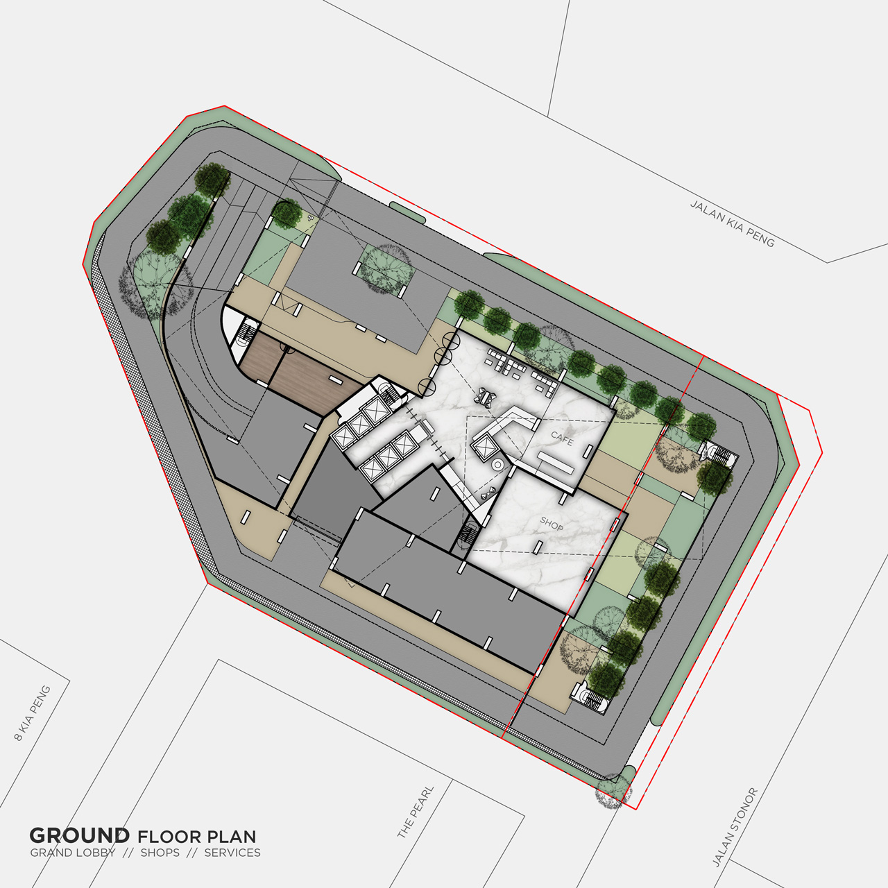
The client loved our design on this project and we got the green light to go ahead and develop the project further. There was one problem though, and that was a major land issue. As you can see in the layout plans, there are 2 pieces of land, and our client owned one of them. The other one belonged to a Singaporean-Indonesian pharma (?!) company that initially wanted to partner up with Masteron to develop the land and share the profits. Unfortunately they changed their mind and decided to keep their land as investment due to the fact that the land price at that area was going up significantly. So they put the project on hold for the foreseeable future.
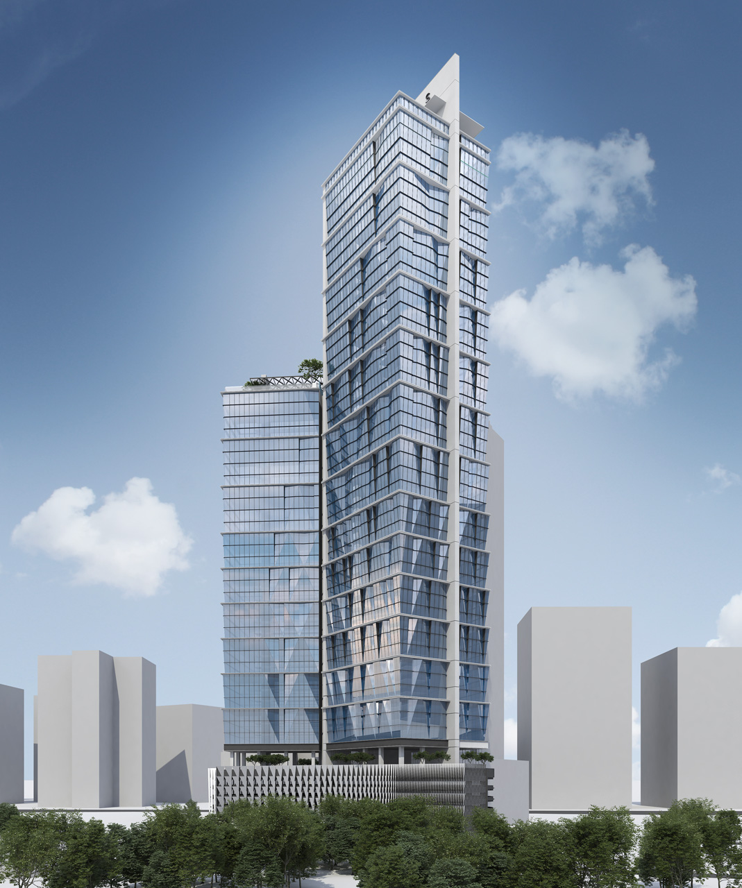
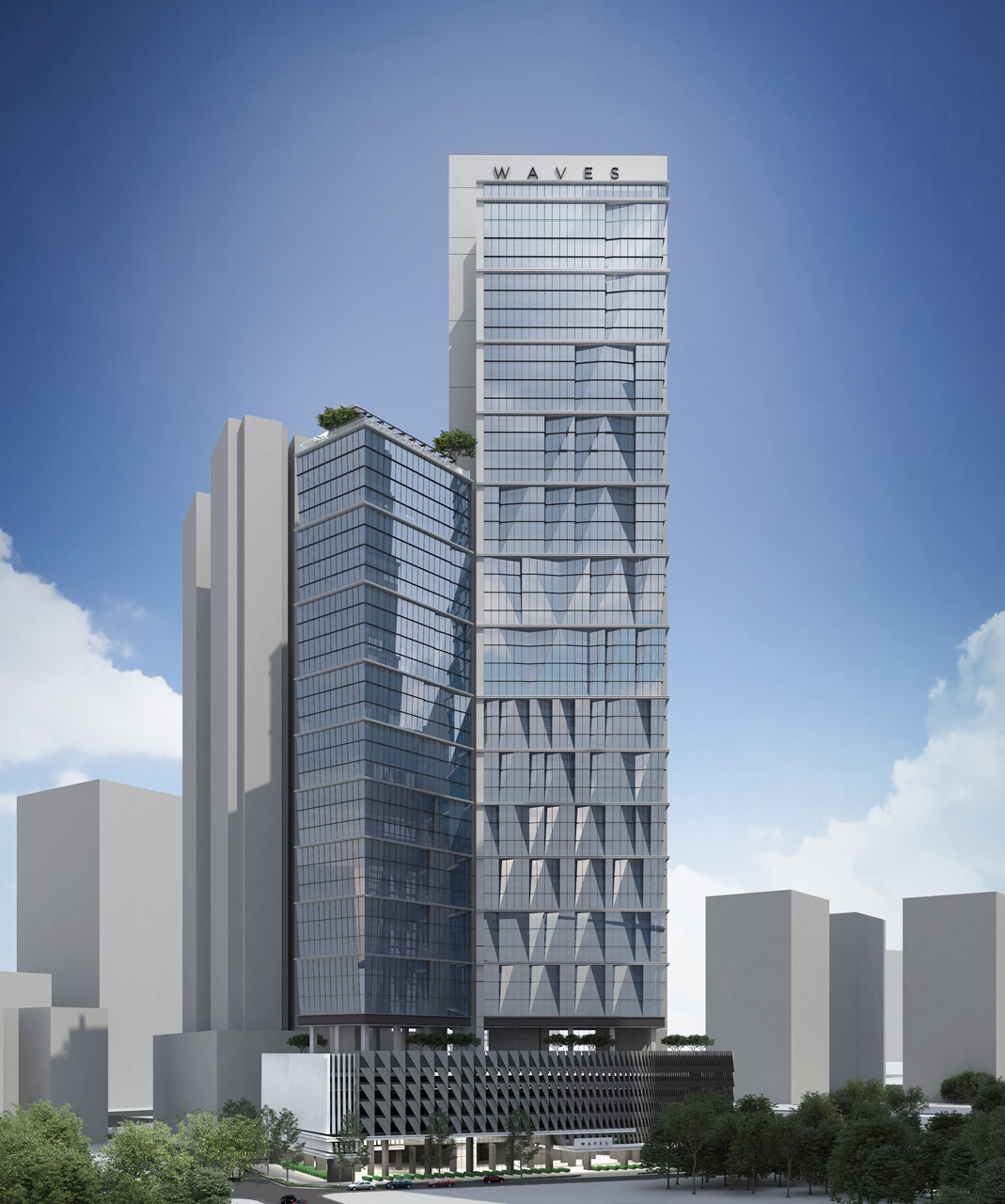
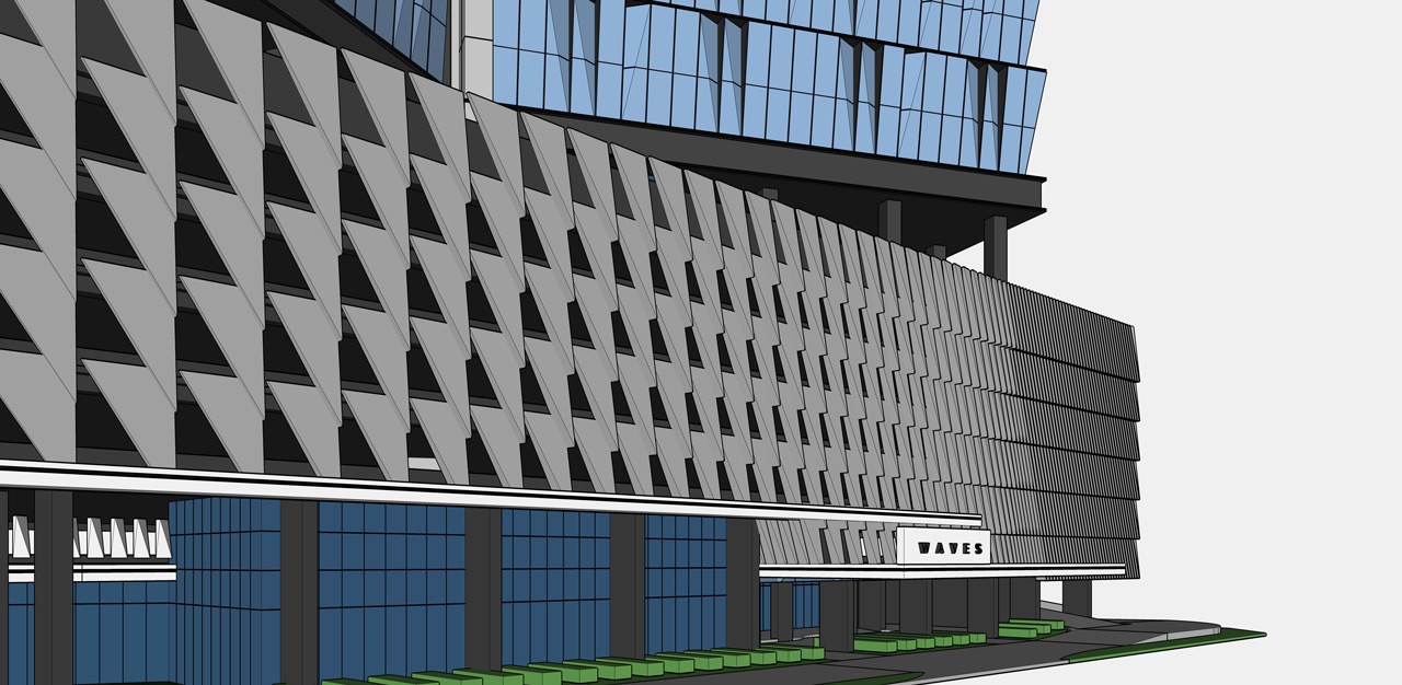
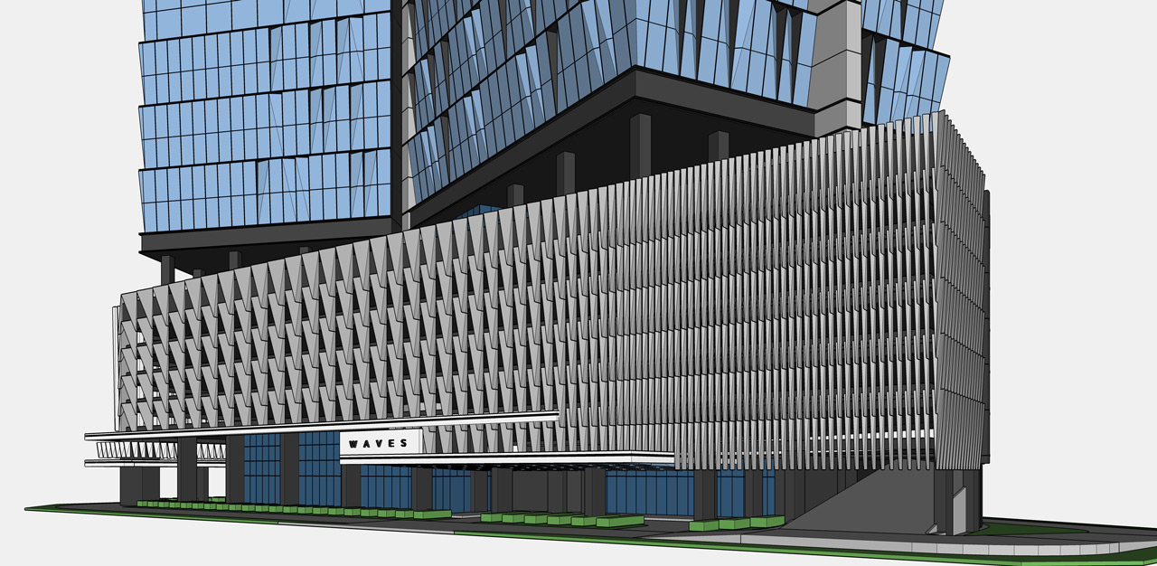
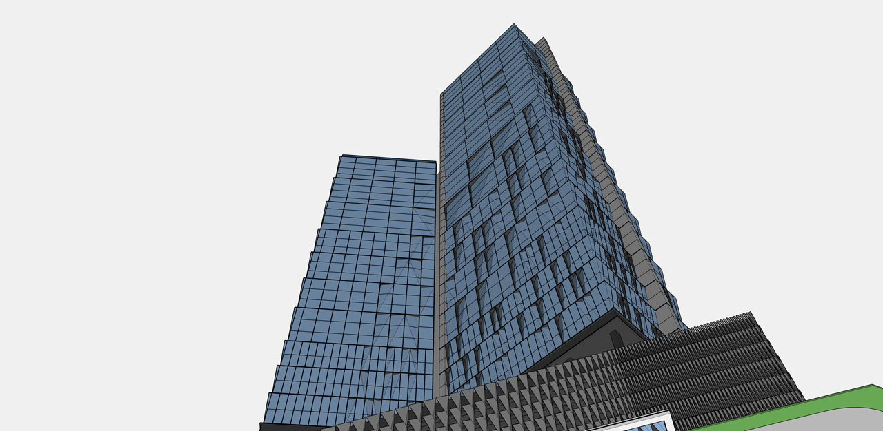
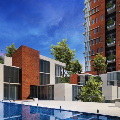
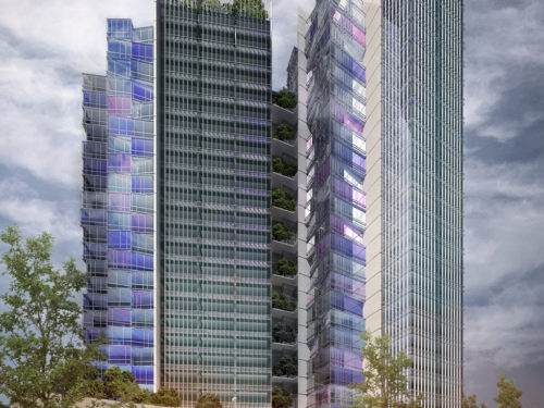
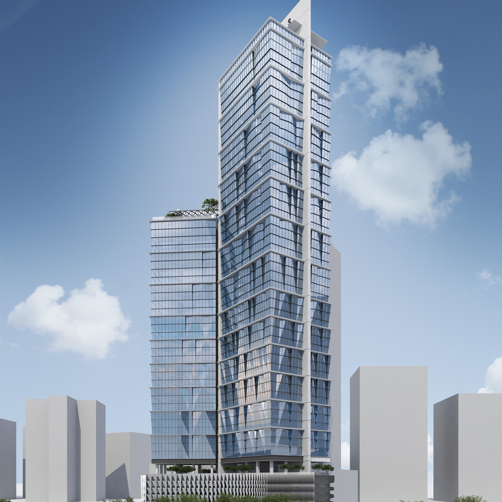
The renders of this project is also a huge let-down. I was so unhappy with the 3d images cause the guy could not get what I really had in mind and ended up producing these horrible renders. That’s why I also included some Sketchup images so the form of the building is a bit more clearer.
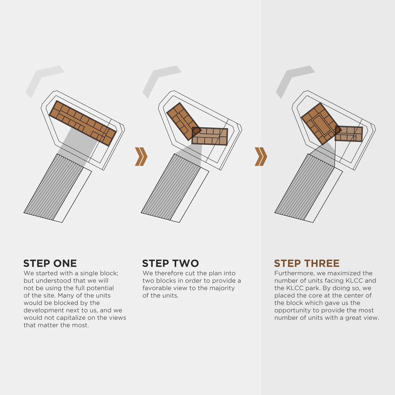
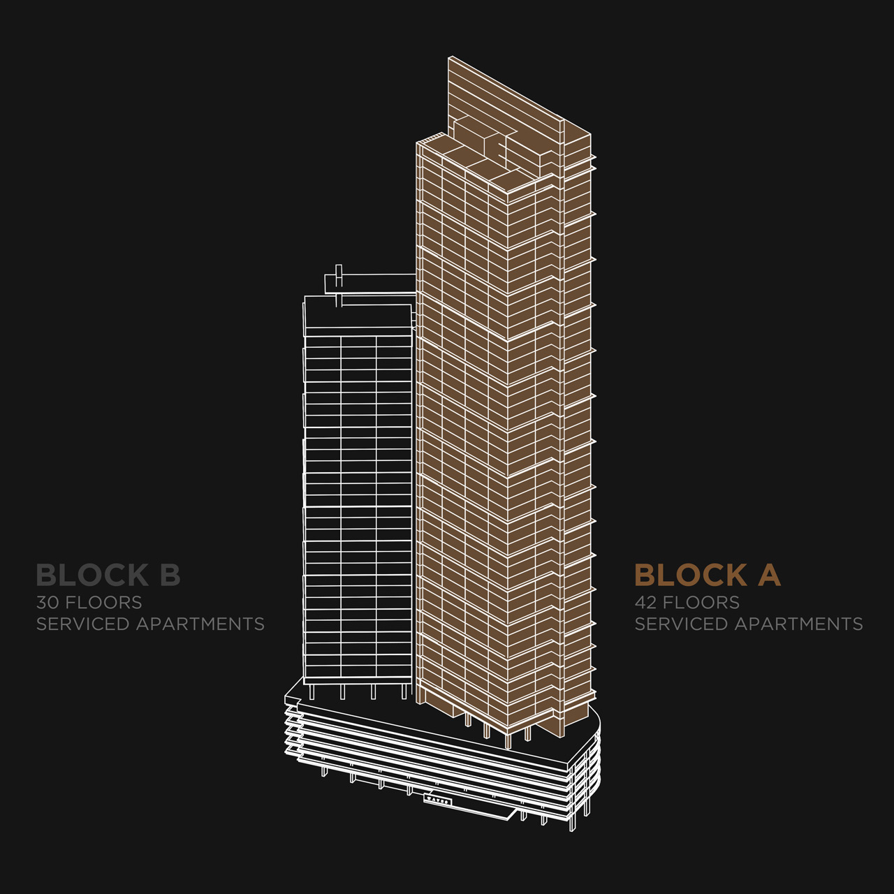
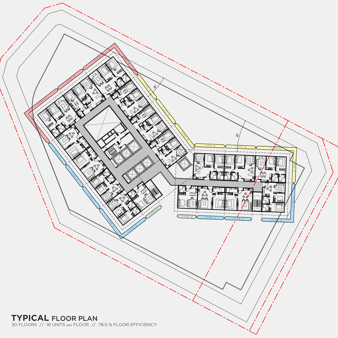
There is a huge tower beside the lot which had been constructed a while ago, and so its not very pleasant to look at. What we tried to do is to design our blocks in such way to avoid any units looking directly towards that existing tower. That’s why we broke the building into 2 towers and rotated them each for awesome views all around the 2 blocks.
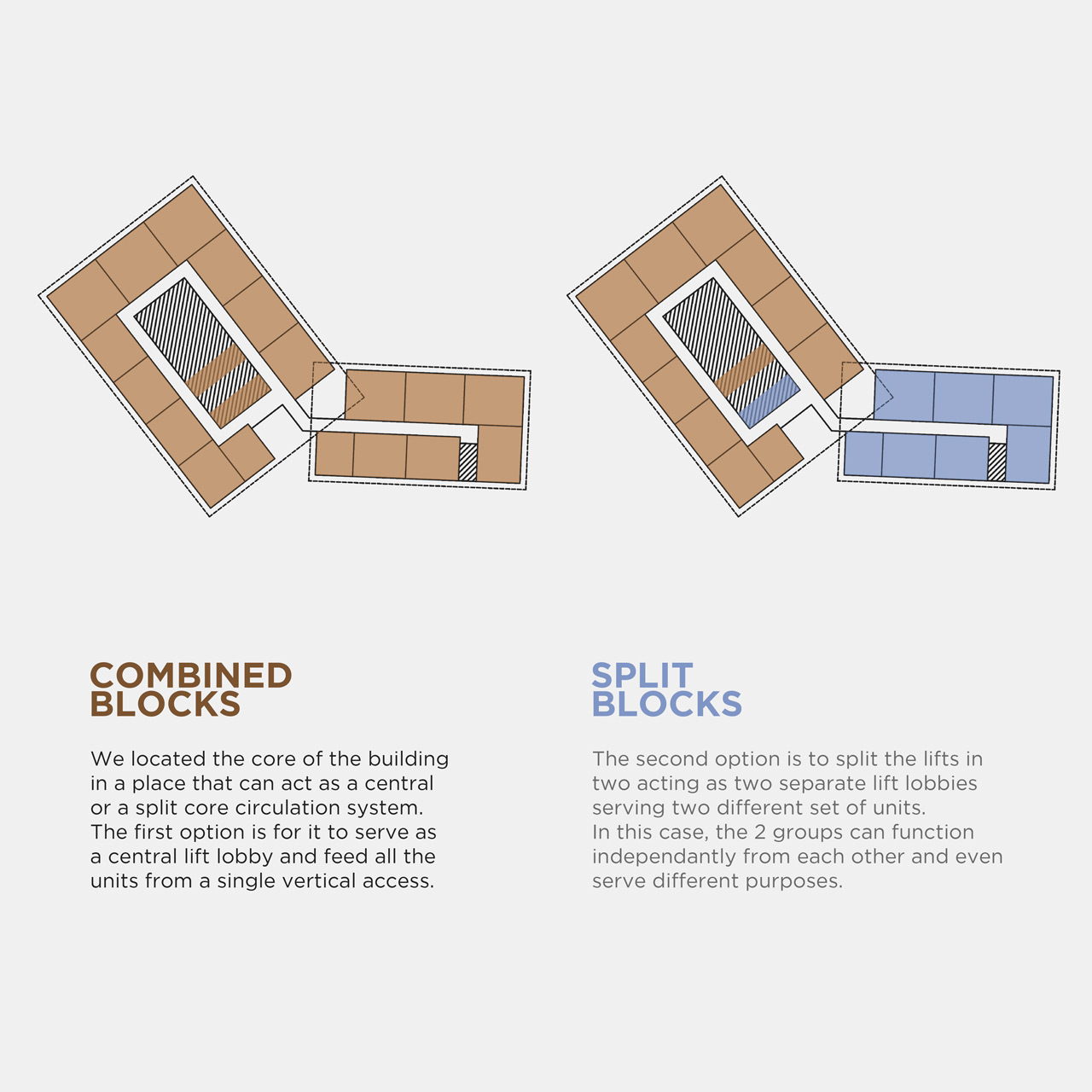
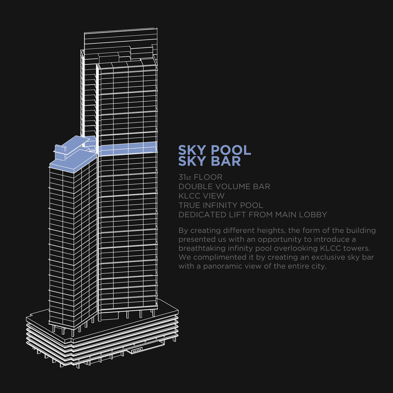
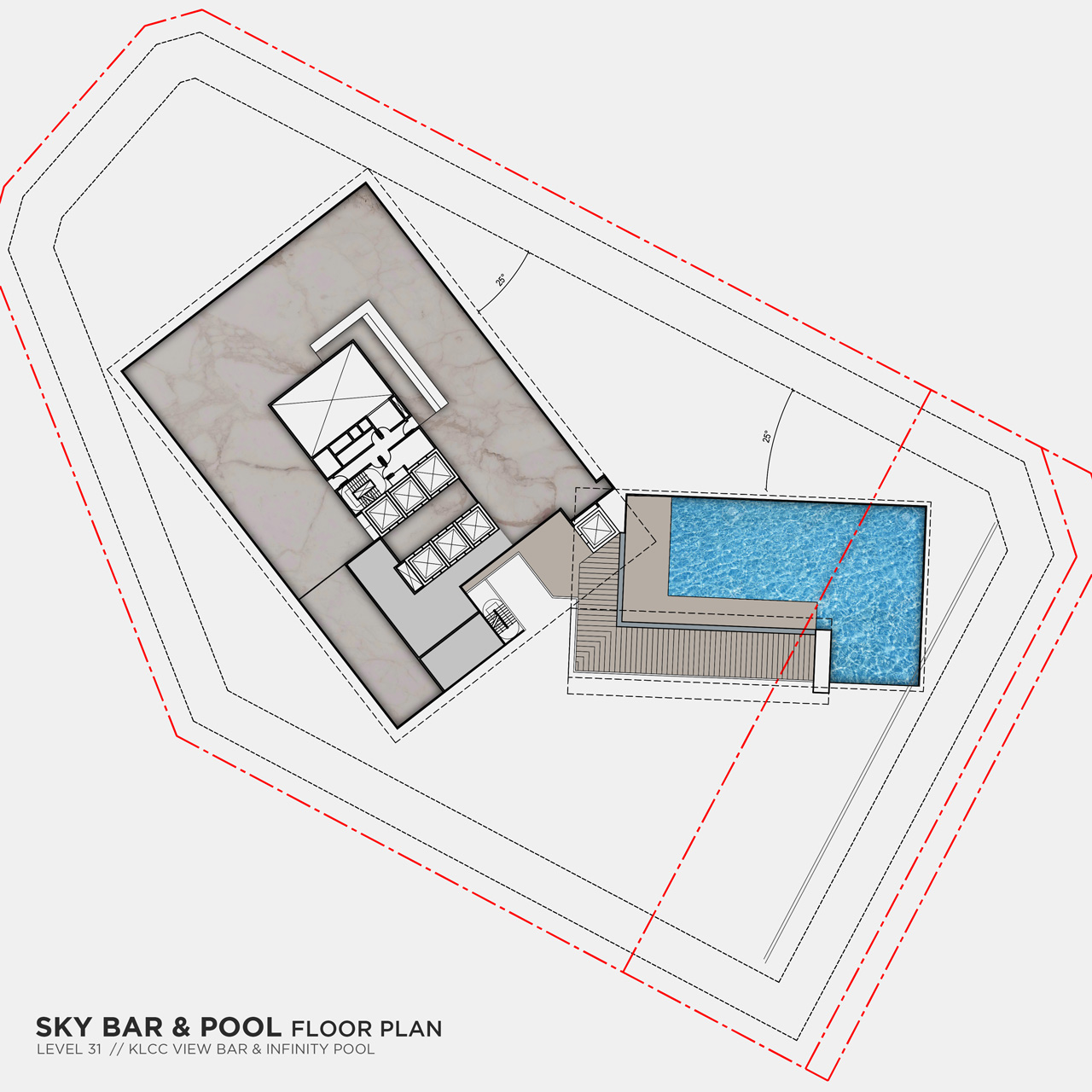
By doing this, the form of the building actually gave us a lot to work with, and so we proposed the possibility of the 2 towers being completely different in usage. We even introduced a sky-bar and sky-pool on top of the shorter tower since the building is sitting at a location with loads of bars and luxury restaurants around it.
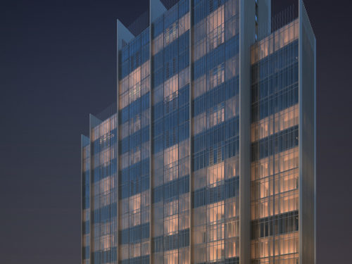
We decided to design the facade with curtain wall and to create a glass pattern that resembles a wave rising up to the top of the tower. The windows of the lower floors in this case were divided into smaller pieces and the upper ones had were larger. By doing this, each piece of glass gave us a unique reflection and so when someone walked past the building, they will see a changing reflection on the facade.
SOME OTHER PROJECTS…
FROM AZDS
